The Challeng
PlutoPay is a digital wallet for people navigating complex financial systems — often in a second language.
Their onboarding process felt bloated and unclear. Users dropped off before even creating an account.
My goal was to redesign the onboarding flow to feel simple, trustworthy, and human — especially for users unfamiliar with financial jargon.
My Role
User Research, UX Strategy, Wireframing, Prototyping, Usability Testing
Freelance · 2024
Process
1. Research & Discovery
I began with interviews and informal usability testing to understand user friction.
We identified two key user types:
- Expats navigating unfamiliar financial terms
- First-time fintech users needing more guidance and reassurance
A simple card-sorting exercise helped clarify the mental models users brought to the app — revealing that the original flow was over-explaining in the wrong places.
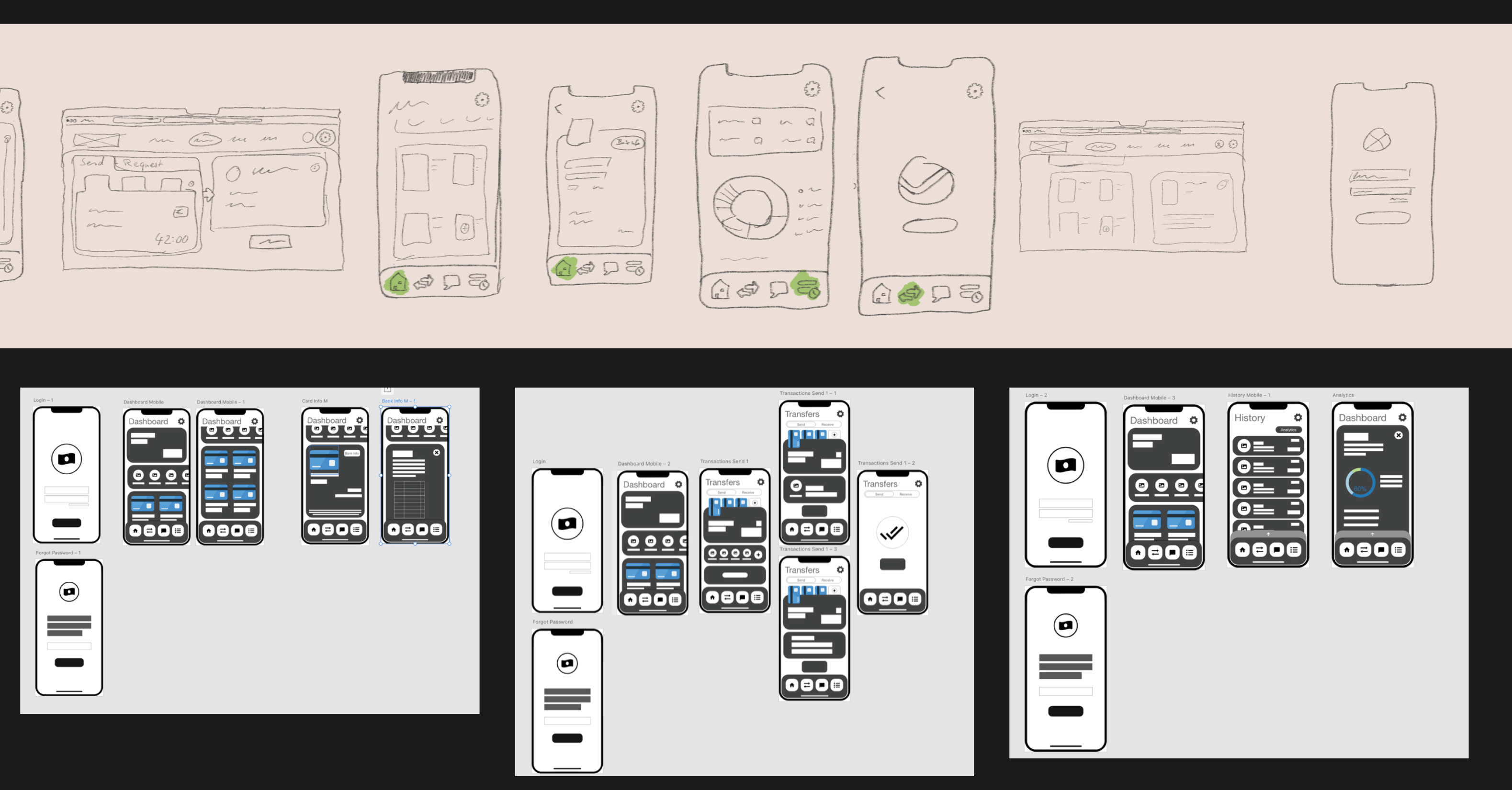
2. Wireframing & Structure
I created a stripped-back onboarding flow in Figma that:
- Focused on just one task per screen
- Used plain language without assuming prior financial knowledge
- Removed unnecessary explanations, letting visuals do the work

This version prioritized clarity, warmth, and micro-interactions that gently built trust.
3. Prototyping & Testing
I built an interactive prototype and ran remote usability tests with five participants.
The feedback was immediate: “This feels easier,” “Now I actually want to finish.”
After two rounds of refinements, we had a flow that felt smooth, minimal, and approachable.

Outcome
- Onboarding completion improved by ~20%
- Users reported increased clarity and trust
- The redesign helped PlutoPay shift tone from corporate to human — and opened the door for broader content changes


Reflection
This project taught me the power of restraint. The less PlutoPay said, the more users understood.
And that good UX doesn’t just reduce friction — it builds emotional momentum.


